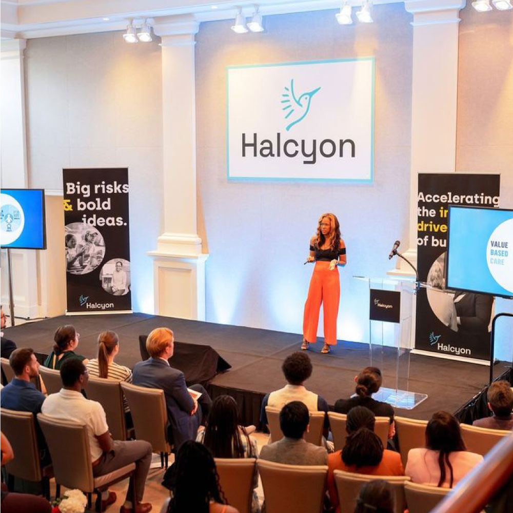
We’d been working with Halcyon for a few years using their existing brand, which was limiting. It lacked personality, locked us into certain styles, and — maybe most importantly — didn’t match the bold persona their work embodied. So we were excited to lead the Halcyon team through a rebrand to equip them with a new identity that lives up to the confidence of their work.
refresh goals
Heading into the work, our assignment was clear: 1) Create a bold, iconic visual brand that matches Halcyon's expertise and confidence. 2) Build the brand around a concept that captures Halcyon's values: their innovation, people-focus, leadership, optimism, connection, and creativity. 3) Evolve the logo to align with the new brand visuals, positioning, and vision — while keeping a thread of connection to the existing bird icon. 4) As always, develop a flexible and dynamic brand system for use across media and applications.
a new brand takes flight
On the logo front, the Halcyon team was hesitant to totally leave behind their old mark. But we created a new rendering that solved scaling and readability problems, and introduced a more modern style that again feels more confident and future-focused, like their work.

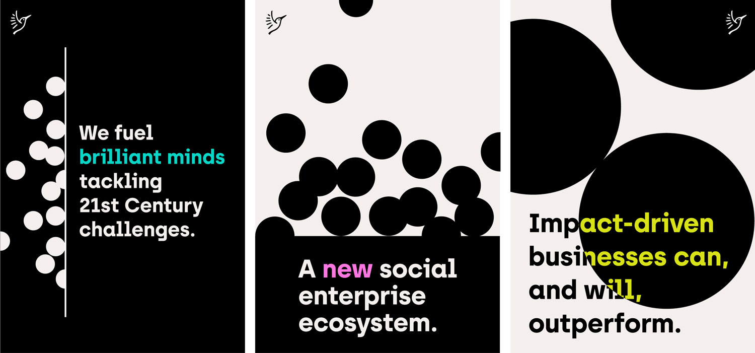
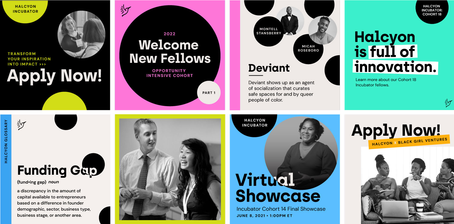
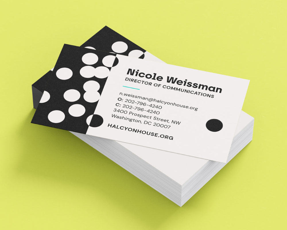
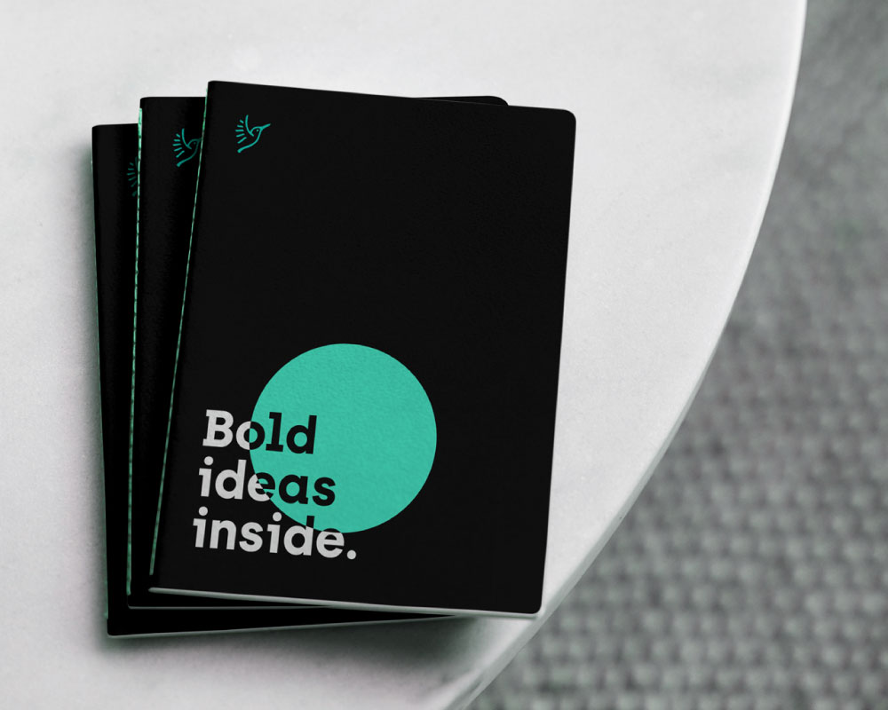
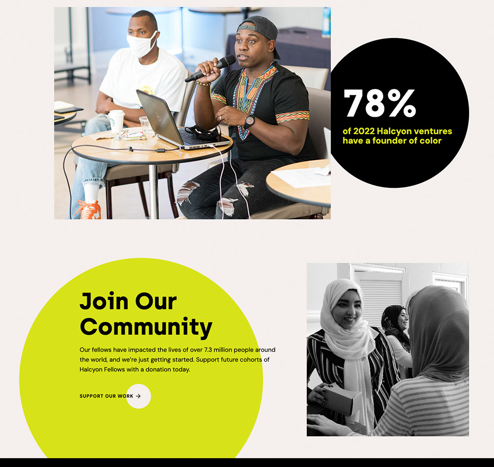
The brand uses black and white compositions with neon highlighter accent colors and a geometric graphic style. We created collateral designs and flexible templates that explore a range of tones and applications. The solid shapes and type-driven style make it easy for the Halcyon team to create their own high-impact branded materials.
“As a small internal team, we need external partners who are like extensions of our own staff. Friendly has always brought positive energy, constructive input, and fresh new ideas. Not only are the visuals great, it extends and enhances our communication strategy.”
Nicole Weissman Director of Communications, Halcyon
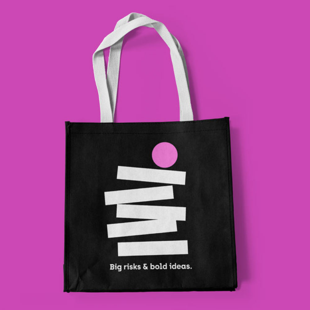
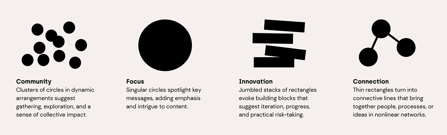
It was also important to capture the strategy of the brand’s visuals. In addition to detailed rules for use, the brand guide defines the story behind the brand’s geometric elements — a strong, simple foundation for us and Halcyon to remix and expand moving forward.
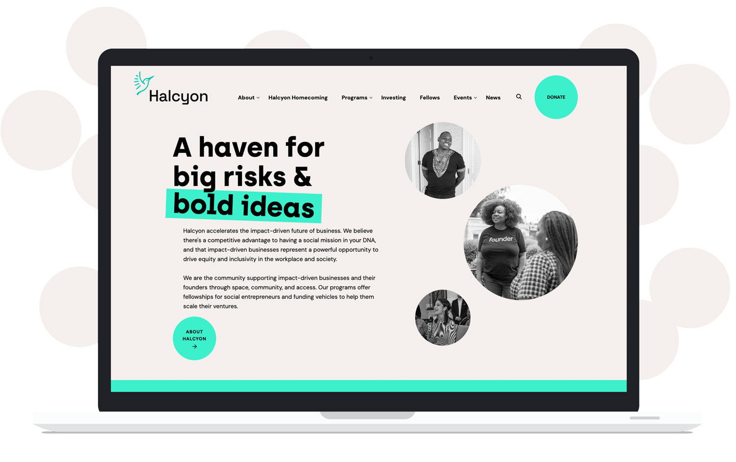
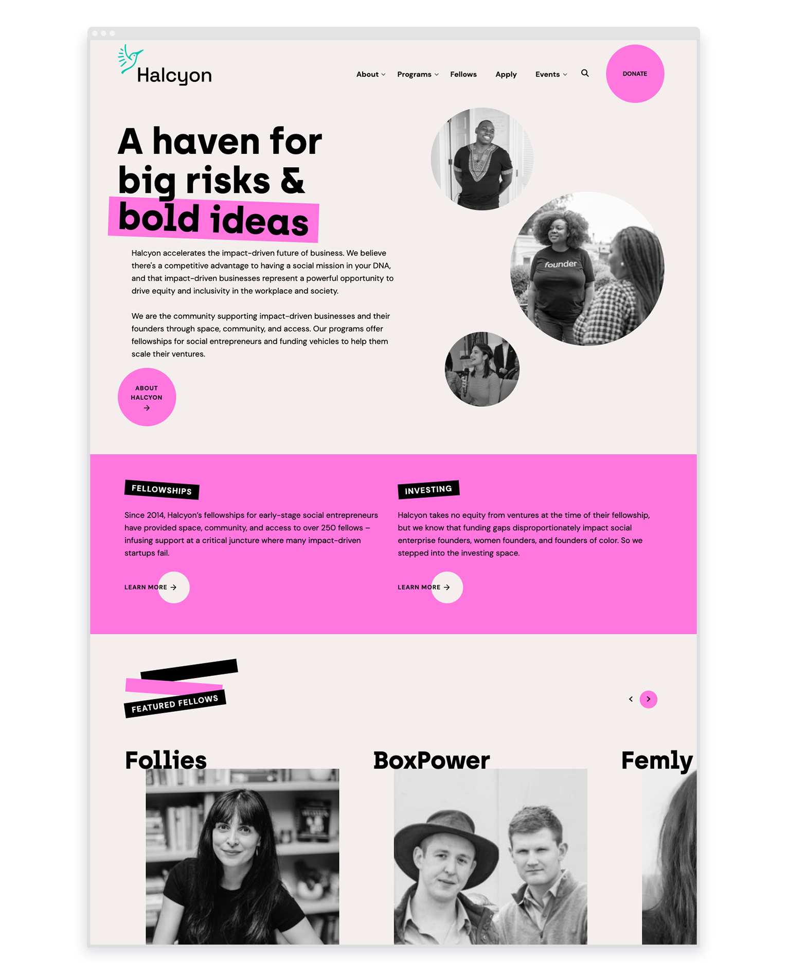
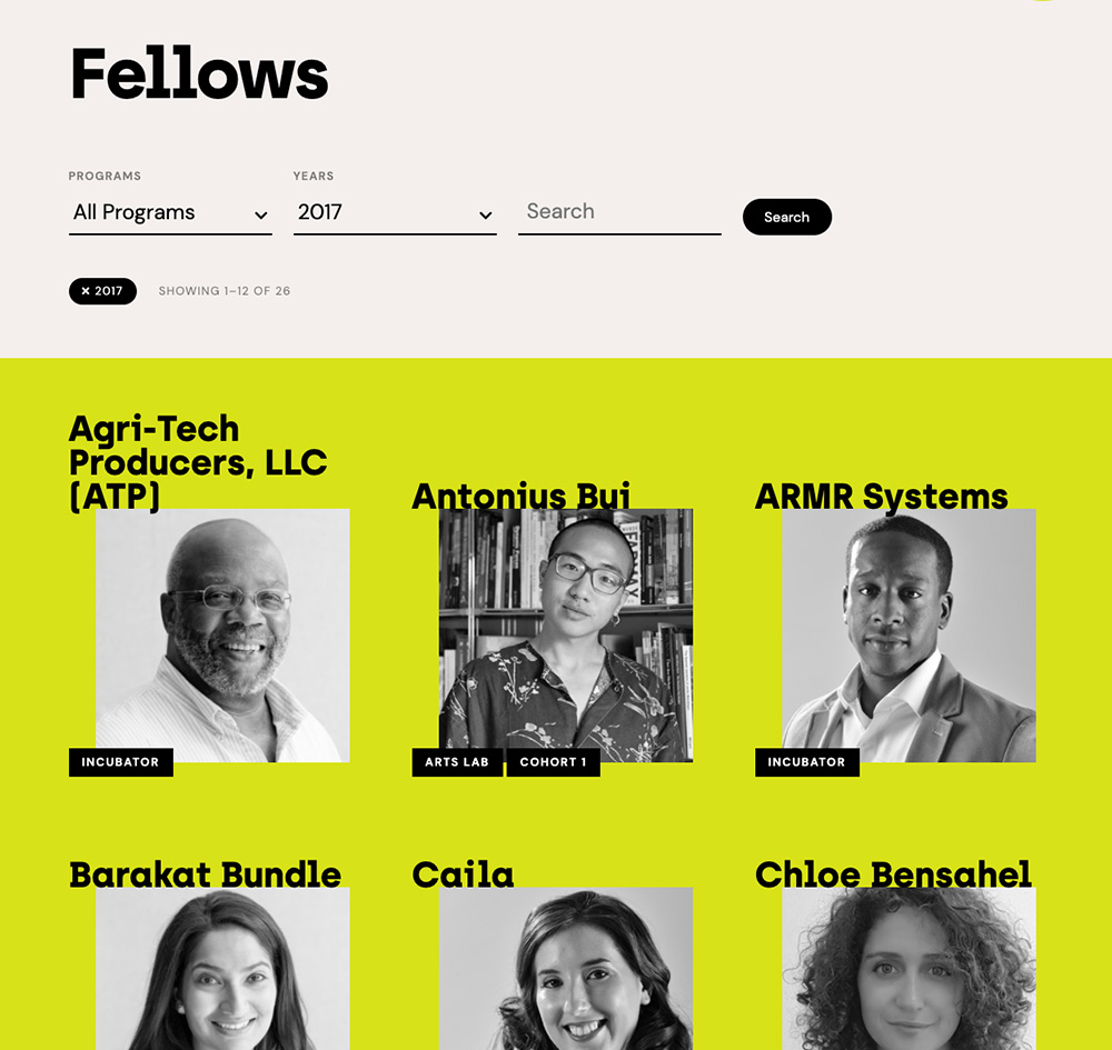
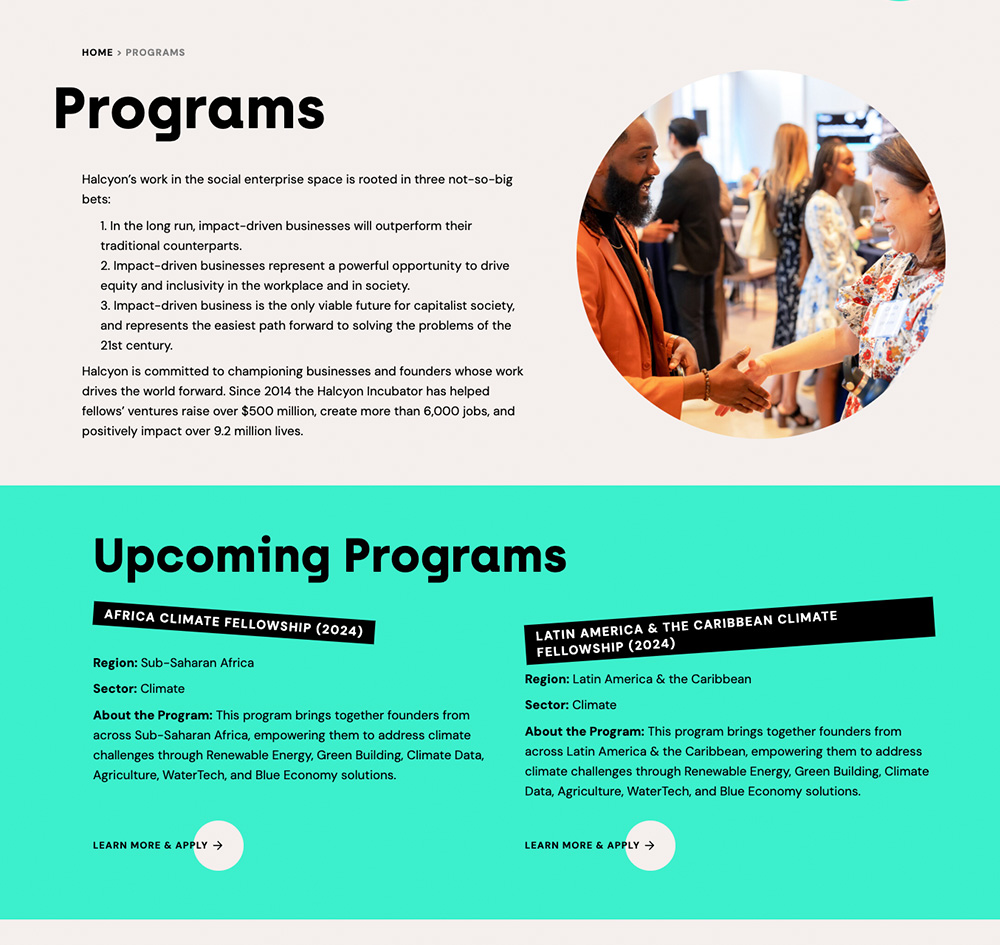
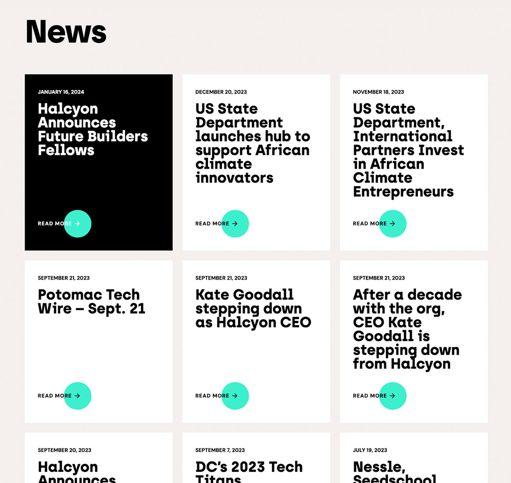
the website
The rebrand also included a new approach for Halcyon’s website. The site is designed to be lively, inviting, and clear for visitors, as well as flexible for the Halcyon team to modify on their own. It’s built with a library of modules that can be endlessly adapted to fit different types of content and new hierarchies. The website uses the new brand’s neon colors to dramatic effect, with large areas of color that take on a random brand color with each page load.
Key outcomes
The brand and website have been a success for Halcyon, effectively reaching their audiences and empowering their team. Some wins include: • Site visitor engagement increased 112%. • Clicks were up 105%. • The web audience grew 27%. • Community and fellows are more eager to share content. • The Halcyon team is better equipped to create effective materials. • Community members feel the new brand better reflects who Halcyon is.
The Halcyon website was also a 2022 Anthem Awards winner, recognized among other impressive mission-driven and social impact projects. VISIT THE SITE HalcyonHouse.org/